J3 Digital Brand Book
A compilation of brand values, guidelines, and assets
Main Logo
J3's logo is the face of the company. It is often the first thing your audience sees, leaving a lasting first impression on them. J3's logo conveys strength, trust, and professionalism—a strong start to a potential customer relationship. Following the guidelines outlined in this section will maximize your brand's recognition and retention with your audience. To access your logo library and download files, scroll down to the assets library.
To access your logo library and download files, scroll down to the assets library.
Approved Variations
There are four color versions for J3's logo to accommodate different scenarios. The logo should never be produced in any other colors. In most cases, the regular full color version should be used, unless the background it is being placed on is dark (use reverse full color version) or the logo is being printed in one color (use one color versions).
Regular
One Color
Full Color
Reverse
One Color
Full Color
Clearspace
All logos require a certain amount of clear space around them so they stand out and are not crowded by other elements. For J3, the clearspace on all 4 sides should be equal to the width of “J” in the logo. These guidelines are scalable, so no matter what size the logo is, this rule can always be followed.

Adding a Tagline
In the case that a tagline or other verbiage needs to be present, a set guidelines have been established on how to style and position the text. This allows complete user control to change the subtext depending on the scenario while maintaining a consistent look throughout J3's materials. If you need to include subtext with the logo in your document, make sure the text matches the following specifications:
- Font: Verdana Italic
- Color: 50% Black, #939598
- Placement: Right of the logo, vertically centered
- Size: Small (6-12pt) Exact size varies depending on logo size and subtext length
See image example for approximate text sizing in relation to logo.

Do's and Don'ts
The following examples show some potential mistakes that must be avoided at all costs to protect the integrity and consistency of J3's brand identity.

Do not remove elements

Do not add elements

Do not stretch the logo

Do not resize or rearrange elements

Do not place the logo over busy backgrounds

Do not place logo over bright/medium value colors

Do not rotate the logo

Do not change the spacing

Do not change the colors

Styling
Colors
Color has a powerful effect on human emotions and plays a significant role in connecting with your customer base. For J3, we have developed a minimalist color palette that expresses prestige & quality with the primary gold/orange color which contrasts nicely with the charcoal.
Gold
Primary- PMS 124 C
- CMYK 4 38 100 0 C
- RGB 240 167 31
- HEX #F0A71F
Charcoal
- PMS 426 C
- CMYK 70 64 63 63 C
- RGB 46 46 45
- HEX #2E2E2D
Bright Teal
- PMS 2197 C
- CMYK 63 1 8 0 C
- RGB 65 194 226
- HEX #41C2E2
Cool Grey
- PMS Cool Gray 1C
- CMYK 10 7 5 0 C
- RGB 217 217 214
- HEX #D9D9D6
Typography
Typography not only plays a large role in expressing a brand's personality; it is also largely responsible for providing clarity in our messaging. It sets the tone to draw customers in, creates hierarchy to keep them focused, and captures their attention so they continue reading. J3 has a single brand font, Montserrat, with several weight options to provide variety while keeping the same typographic look across materials. It is recommended to download and install this font to your computer so it can be used for all external facing documents.
To download and install brand fonts to your computer, scroll down to your assets library.
Montserrat
Light
Regular
SemiBold
Bold
ExtraBold
AaBbCcDdEeFfGgHhIiJjKkLlMmNOoPpQqRrSsTtUuVvWwXxYyZz1234567890!?@#$%^&*()
Image Guidelines
Uniform photography is an integral part of building a strong and consistent brand presence. Having a defined appearance, tone and mood of visual communication is critical. J3's photography should always reflect a high level of professionalism and quality workmanship. Images should be a mix of people and construction related elemetns. Showcase people who are "experts" in their area doing high confidence activities. It is also best when images can have colors that align with your brand colors. Remember images are an extension of your brand.

Property Management

Tenant Improvement

Commercial Construction

Real Estate
Application
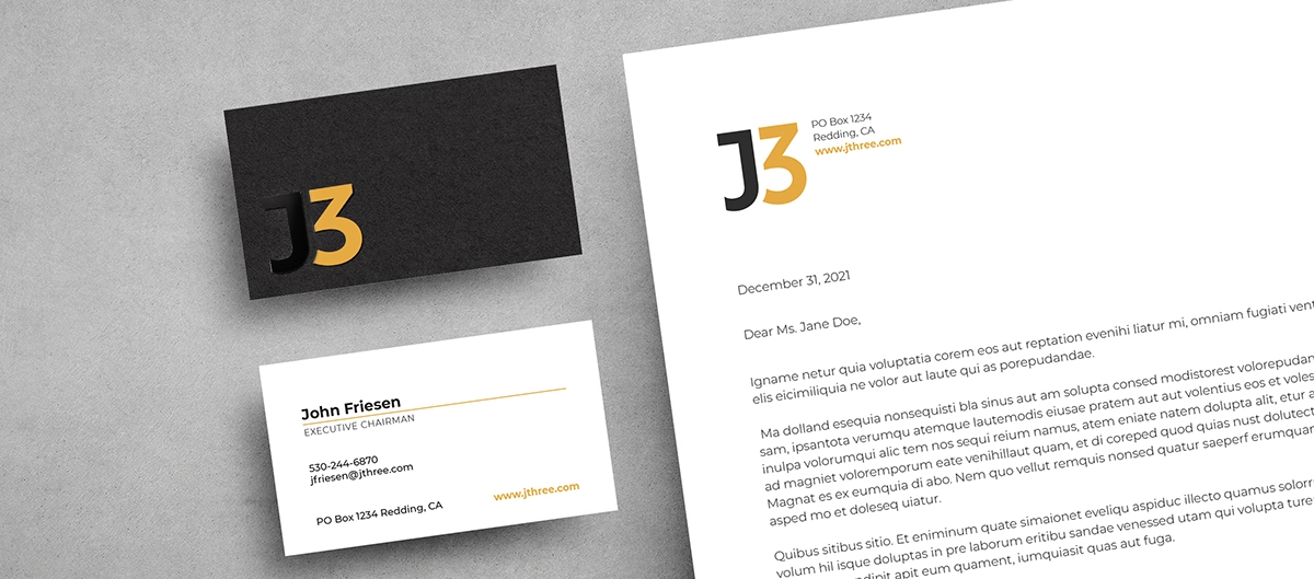
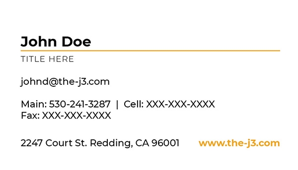
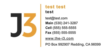
Business Cards
Like your logo, business cards give a lasting first impression of your brand. The look and feel of your card sets the tone for what kind of business you run, and offers a more personal way to connect with a potential client in comparison to an email. J3's business card is designed to impress while staying sleek, minimal and professional. The layout is simple and clean while the front and back offers dynamic contrast. The paper stock has a matte finish with the “J” on the black side printed in high gloss. This is the standout element of the card that will get potential clients to remember you and reduce the chances of them throwing it away.
Need to order a business card? Use our online business system order form and our team will reach out within 24 hours.

Email Signature
An email signature is like a digital version of your business card. It's an effective way to close out an email and ensure the receiver knows your basic personal and business information. It also strengthens your brand identity. J3's email signature should be used by every team member that uses a j3construction.com email.
To generate an email signature with your personal information, use our email signature generator.
Assets Library
Download Assets
Access all four of J3's logo versions in various file formats as well as J3's brand font using the dropdown and associated download links below. If you'd like to download a complete brand package with all assets, click “Download All”.
Generate An Email Signature
Use this form to enter in your personal info and generate a J3 email signature that you can easily copy and paste into your emails.
Order Business Cards
Use this form to order business cards for any employee. The form accepts all major credit cards and our team will email you a PDF proof for approval prior to printing and shipping.